NOTE: This is the first segment of a 7-part series that describes the eCommerce web design tips. See the index to this series for the complete list.
Many people only start to think about improving their E-commerce website after their e-store is operational.
Below are seven critical and common mistakes that are often made during an E-commerce web design project, with highlighted solutions that can help you avoid them.
1. Information Overload
You may yourself have come across many ecommerce sites designed purely with SEO in mind – they tend to contain too much text and an overcrowded design.
All too often you and your web designer may think very little about usability and focus more on SEO. This leads to a scattered approach that will rarely produce results from your website.
My recommendation:
Clean design is very important in this area and many companies are using it to help showcase what they have to offer. These days, many companies are ditching multiple colours, models and movement on their websites in favour of more minimal design schemes.
There’s good reason for this – a simple design scheme allows a brand to show off its products. Less focus on super-complicated design gives companies more time to focus on the user experience. After all, the prime concern for an E-commerce site is sales. To generate these, a site must function well, load quickly and make it easy for customers to find what they want and make a purchase.
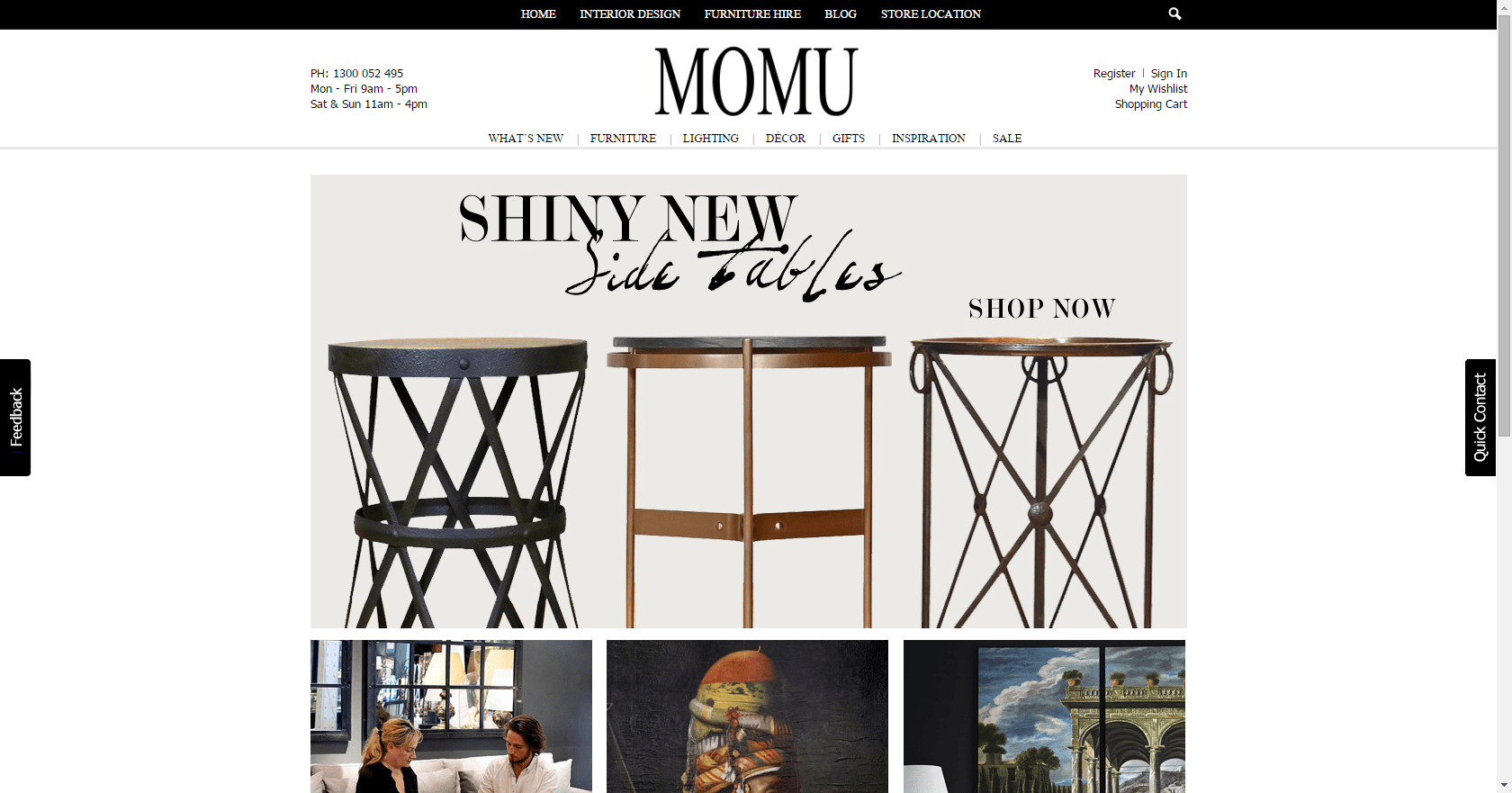
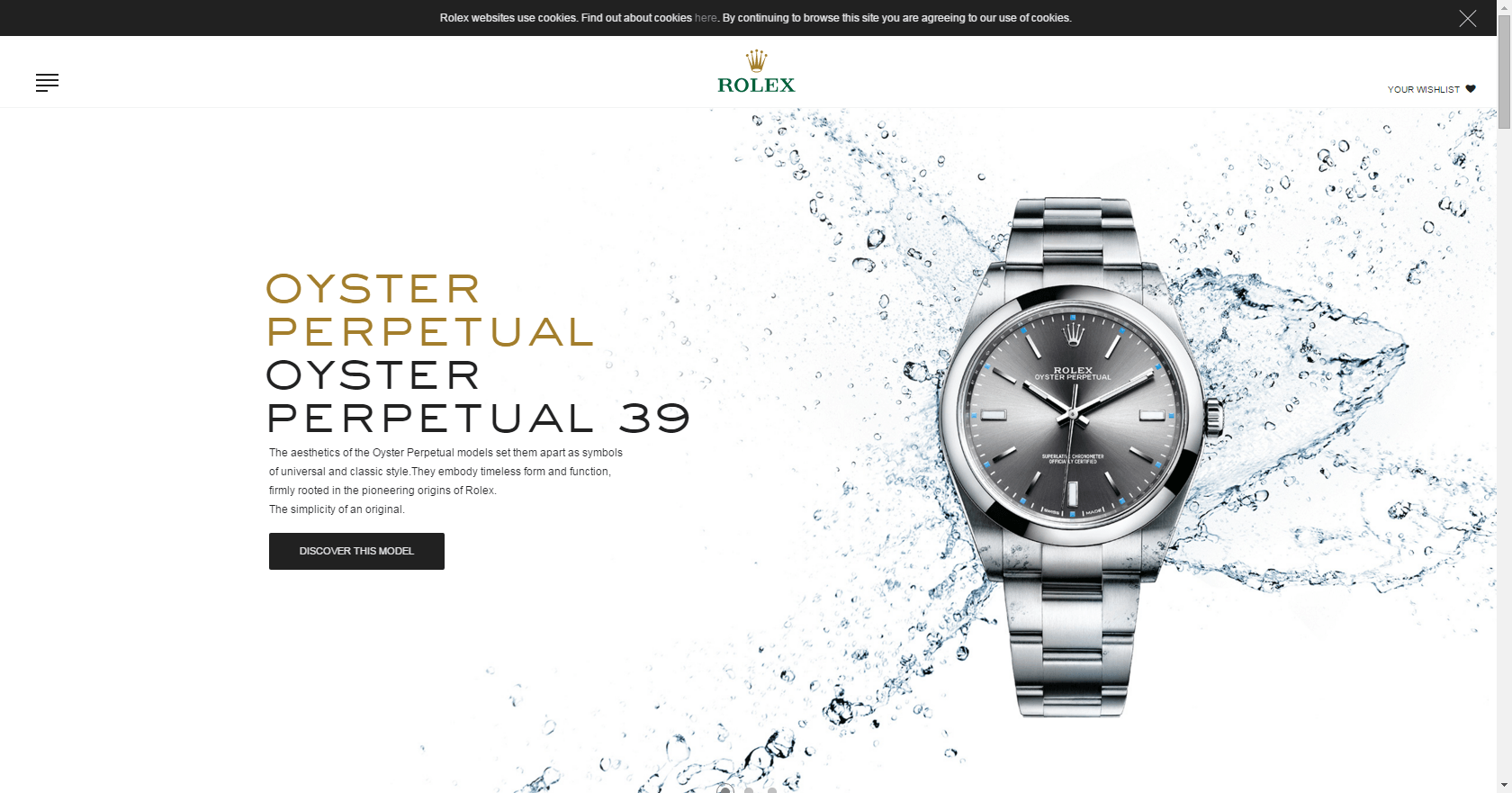
I have listed few examples of clean e-Commerce Web Design below.
2. Lack of Clear Shipping Information
Many E-commerce sites don’t show their shipping rates prominently enough to their users; sometimes it doesn’t appear until you get to the checkout stage, meaning you don’t know how much shipping you are required to pay on the order.
I myself have abandon purchases many times because I was shocked to see a high shipping price at the checkout stage, or even just because it was hard for me to find shipping rates on the site. Surprising people during the checkout process with unexpected costs will kill your conversions.
My recommendation:
Most shipping companies, for example, China Post, offer calculators on their website.
There are also plugins and widgets available that can calculate a product’s shipping price. When you use such plugins on the product page, you’re giving your visitors an opportunity to calculate the shipping price before purchase.
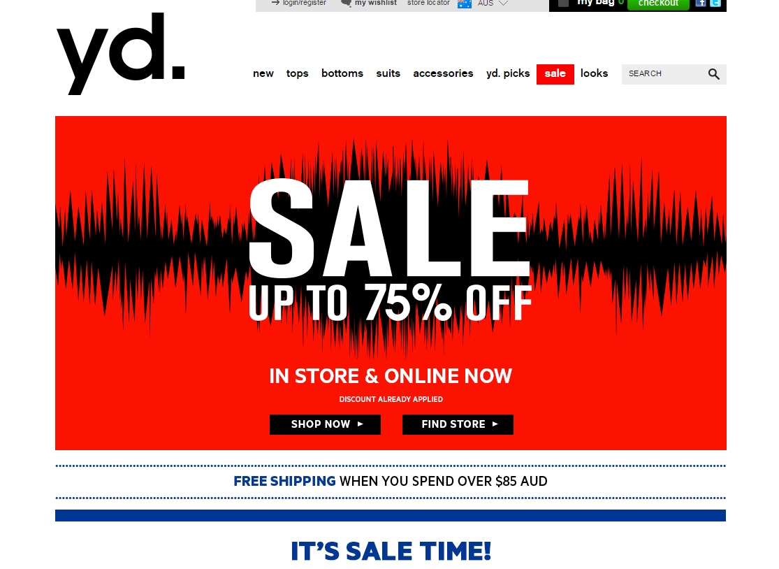
If you offer free shipping or flat shipping rates, highlight this on your website so your customers are aware of this as soon as they visit your site.
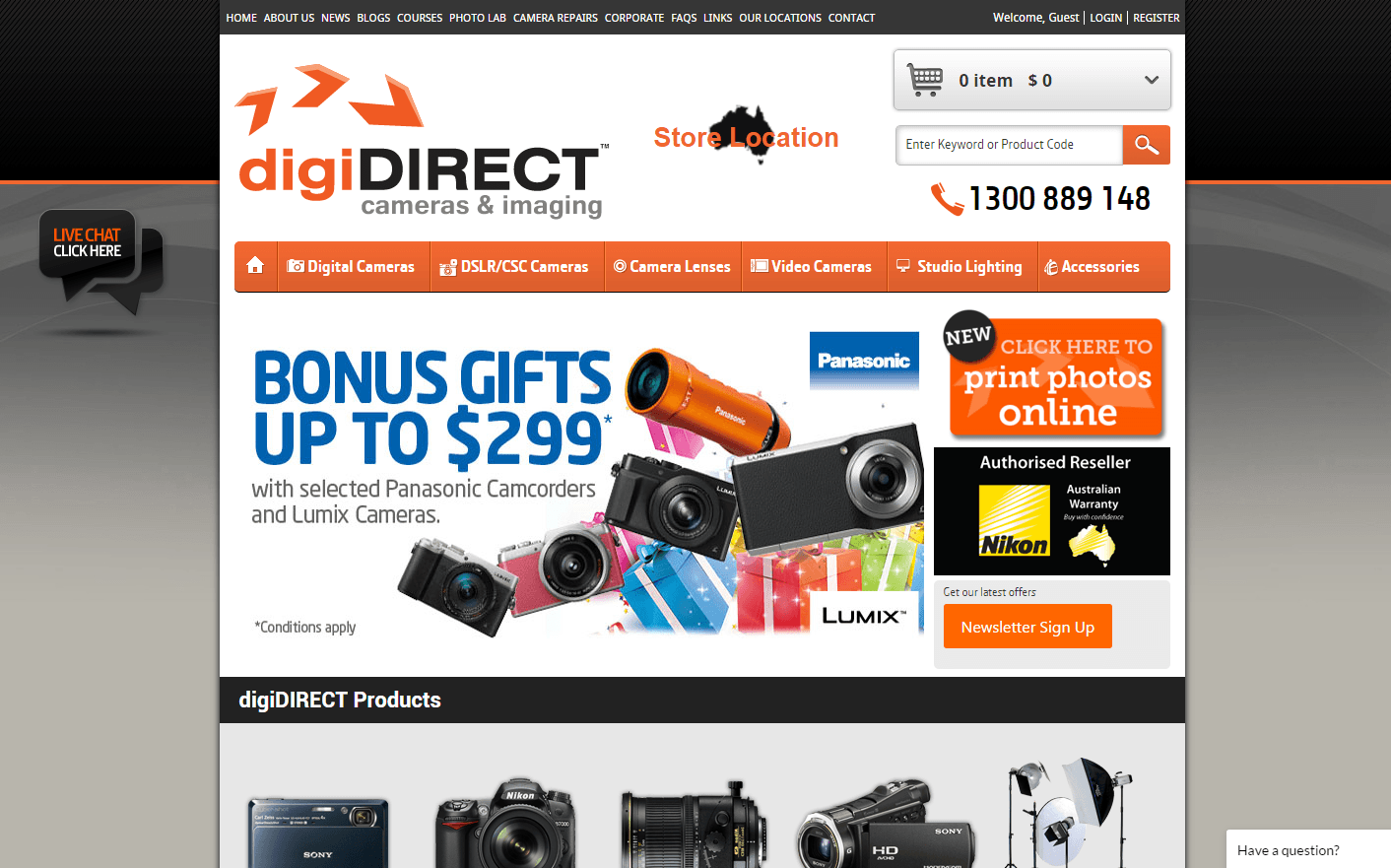
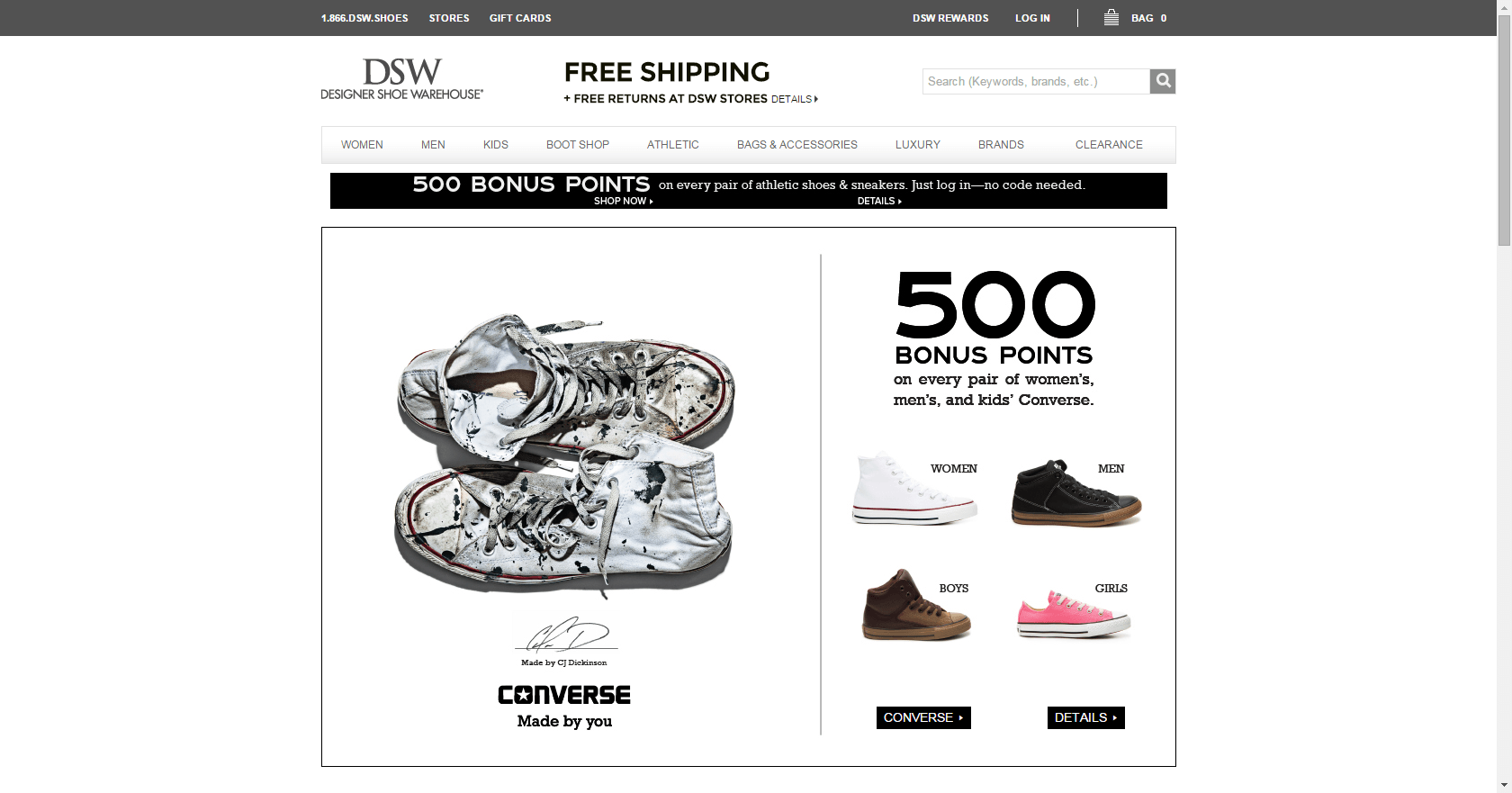
Couple of eCommerce sites which clearly shows shipping information on home page.
3. Lack of Proper “About Us” and “Contact Us” Pages
I have been involved in optimising conversion rates on many E-commerce websites, and one of the things I have discovered is that the number of visitors who go to the “about us” and “contact” pages is surprising – they are second most visited pages on most websites after the home page.
My Recommendation:
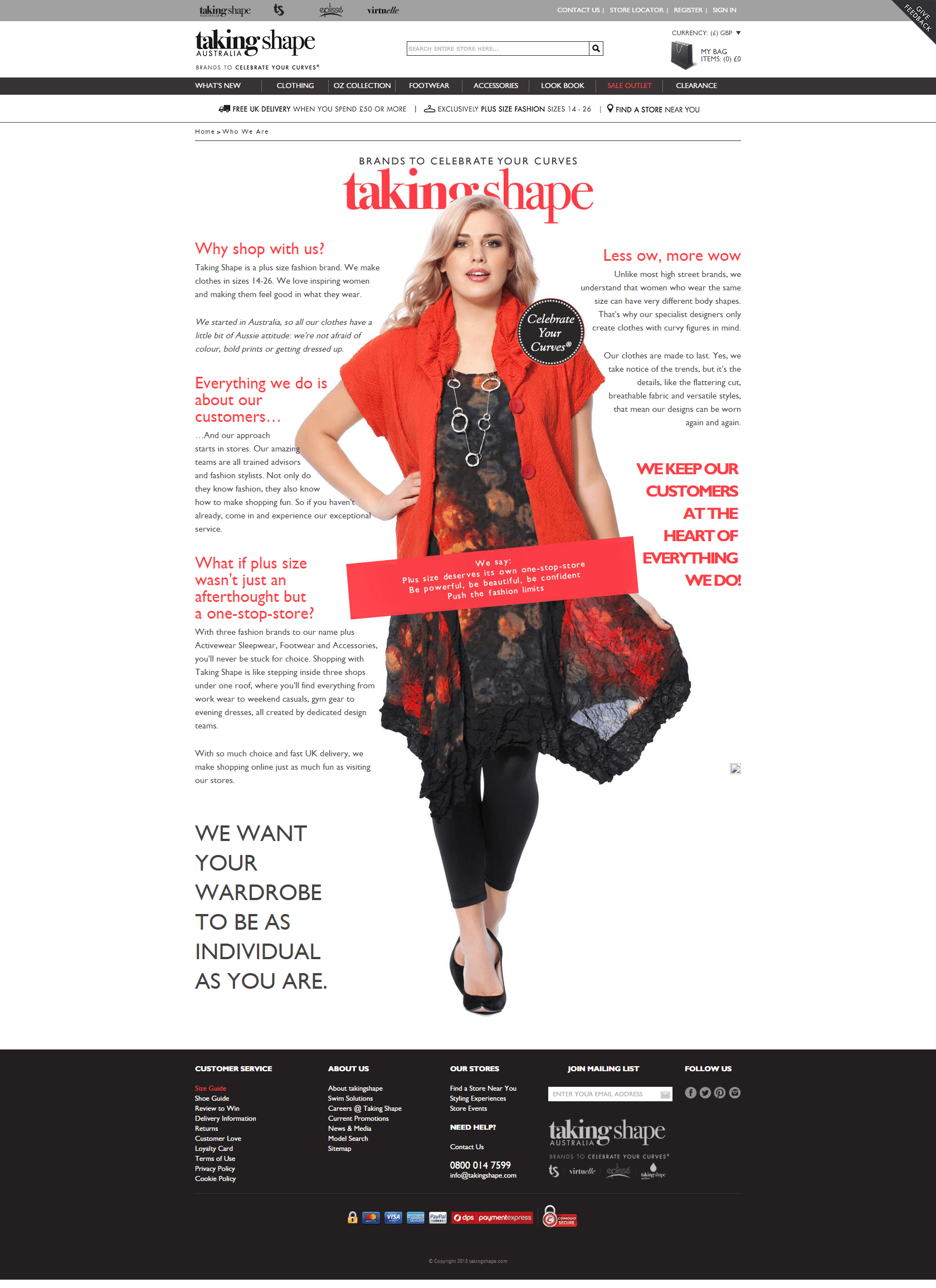
About Us Page must tell story about your business, your website, your products and how they are made.
You don’t have to create a detailed story (although you can if you want to), but at least a very brief one about what makes you different in a crowded online retail space is very important.
Contact Us Page: Even if you are an online store, people still like to know your physical location for number of reasons, the foremost of which is that they find it comforting to know that your business doesn’t exist only online and has a physical location as well.
Provide them with detailed information about where your warehouses are, where you ship all your orders from, what email address to contact, and so on. I also advise against using generic email addresses – provide personalised email addresses if you have support staff to answer any queries.
Takingshape has done both pages right.
4. Very Basic Product Descriptions
One of the biggest mistakes E-commerce shop owners make is to copy default product descriptions from the manufacturers they stock.
This makes it difficult to differentiate your products from those of competitors. Another mistake is to provide minimal or no product description – this discourages people from making purchases as they have no information to work with.
My Recommendations:
Great websites realise that product descriptions can be leveraged in many ways beyond increasing conversions – they’re also important for getting more visitors to your site, because they are an excellent place to put targeted keywords and phrases that help your SEO efforts.
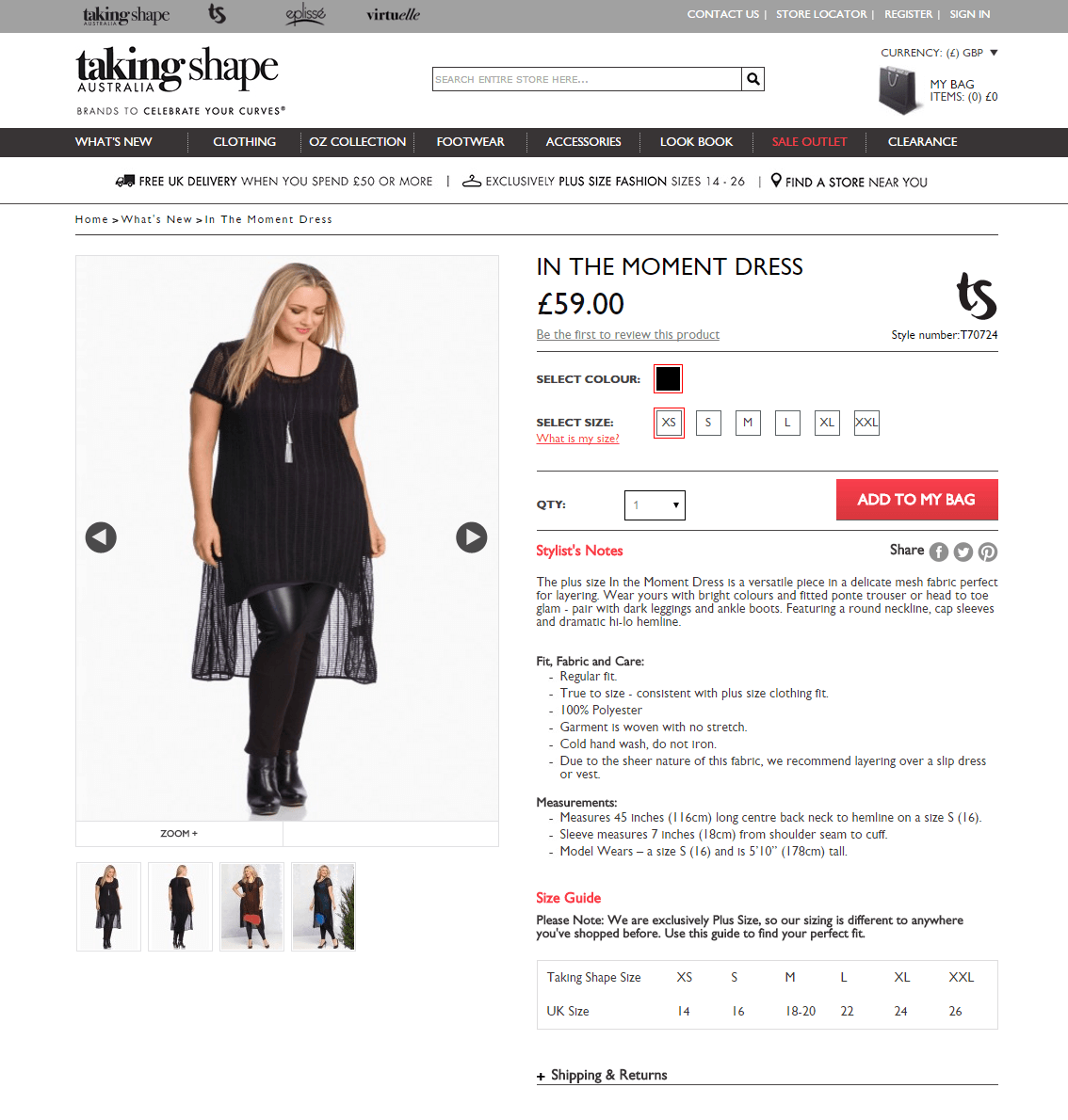
Write custom product descriptions for all your products and make sure that you list product benefits more prominently.
An example of nicely written product description.
5. Very Tiny Product Images and Poor Product Page Design
If you seriously want to sell online, you must have great product photos and product details. This is what differentiates between a successful Ecommerce site and the one that closes before the first year of hosting has expired.
My recommendation:
Think about how products are displayed in brick and mortar stores.
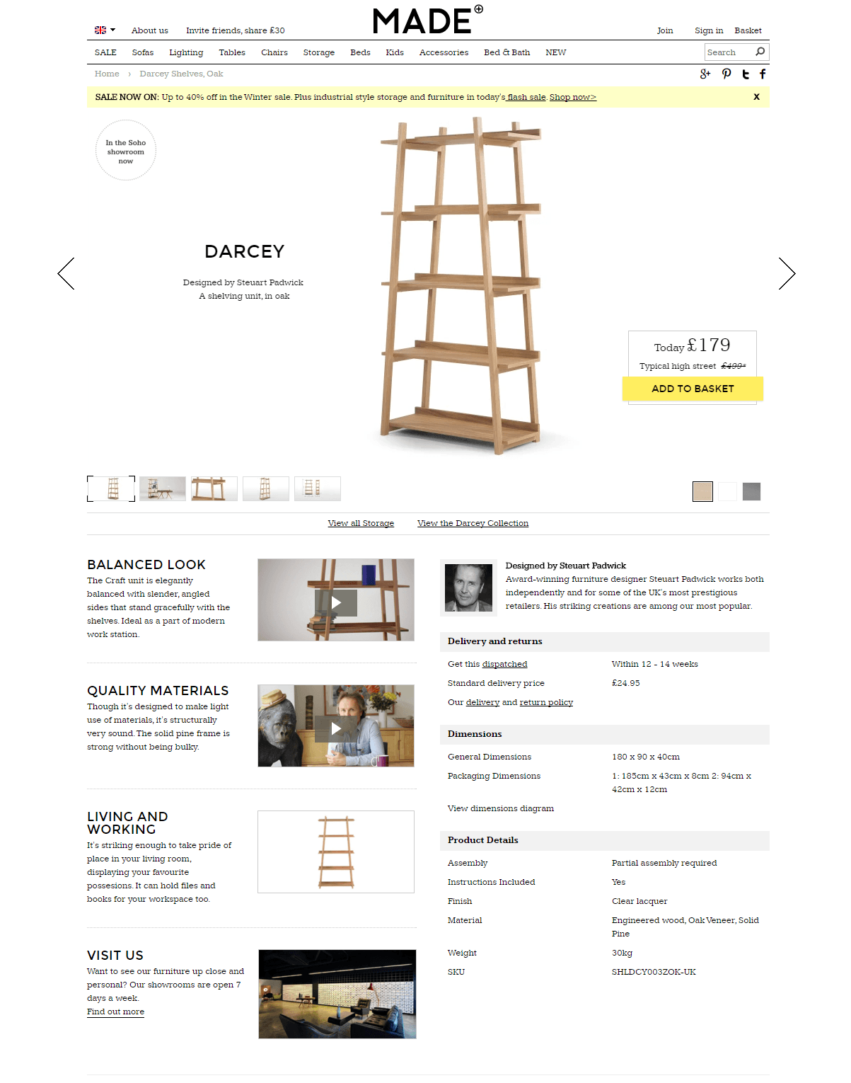
While an in-store or window display may show a lot more than just the products for sale, all elements contribute to showcasing them in their most flattering light. So do the same with your website: make sure that every design element present is doing something to showcase your products in their best possible light.
Well-designed product pages will improve your shopper’s experience by providing rich product information. Their design should be such that they look clean and attractive as well as convey a clear value proposition to your shopper by telling them why they should buy from you instead of your competitors.
6. Lack of Payment Options
There are plenty of sites out there that only allow users to pay with Visa or MasterCard, or only with a PayPal account.
There’s no reason for this anymore. What about the person who has an AmEx and doesn’t have or want PayPal? What about the person who doesn’t have a credit card and wants to pay straight from their bank account? You need to provide as many payment solutions as is practical to optimise the number of orders you can process.
My Recommendation:
Use a payment service that lets customers pay with each major credit card, and also provide a bank transfer and cheque as an option. Adding a PayPal checkout option as well increases the choices your customers have, making them more likely to purchase from you.
Consider that different consumers have different preferences when it comes to making online payments and try to cater to as many as you can to expand your customer base.
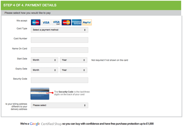
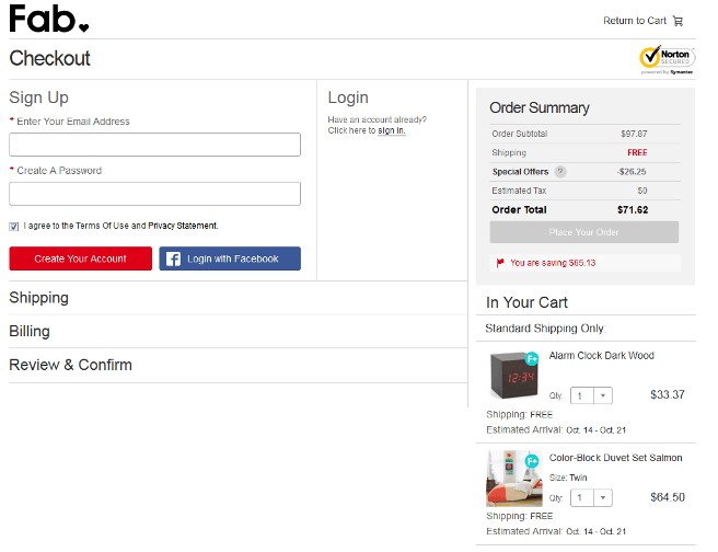
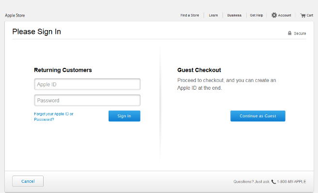
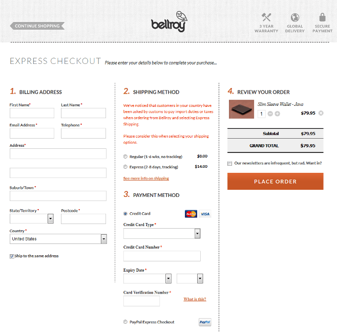
7. A Confusing and Lengthy Checkout Process
This is one of the most damaging mistakes an E-commerce site can make. You have to make it as easy as possible for your customers to hand over their credit card information and complete their order.
Poor checkout design and asking customers for unnecessary information can result in increased abandonment rates and therefore lower conversions.
My Recommendation:
Don’t over-complicate the checkout process; keep it simple as possible, and try not to ask too much information, just what’s necessary to carry out the transaction. Indeed, I would recommend implementing a one page checkout where you can.
Conclusion:
Keep the above points in mind while setting up your online business to at least ensure a simple selling feature on your site which all add value to the whole online user experience. Remember, no site has any value until the user experience is at its nucleus.
At ZOFELA, we have built over 200 successful e-commerce websites over the last 8 years. Schedule a free consultation today  to learn how we can design your e-commerce website that could help you generate more sales and grow your business faster.
