You have a great looking website, it has good content, it looks better than your competitor’s website and you keep your website refreshed over the time; however you feel that you are not getting enough website enquiries or sales from your website.
Many websites are designed just aesthetically well and are not designed to convert.
This is where most websites fail.
At ZOFELA, our team has been working very hard to find and optimise such website to increase the sales enquiries on the website.
We have documented few of the tips to help other business owners make use of our knowledge on how to generate 200% more enquiries from your website
Here is a list of our thoughts on what to do and not to do when building a great, engaging and high converting website design.
1.Include Phone Number in your website header
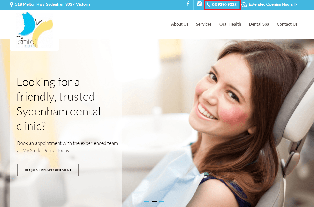
If you have a website and have customer service team who answers the phone during business hours, this is the most important elements that you can have on your website.
Below are some tips on how to incorporate your phone number to increase the leads on your website.
- Create a sticky website header and put phone number on top right corner. I also recommend it to be secondary call to action. Primary call to action should be like make an appointment, request a quote, quick enquiry, get in touch with us etc. depending upon the type of your business.
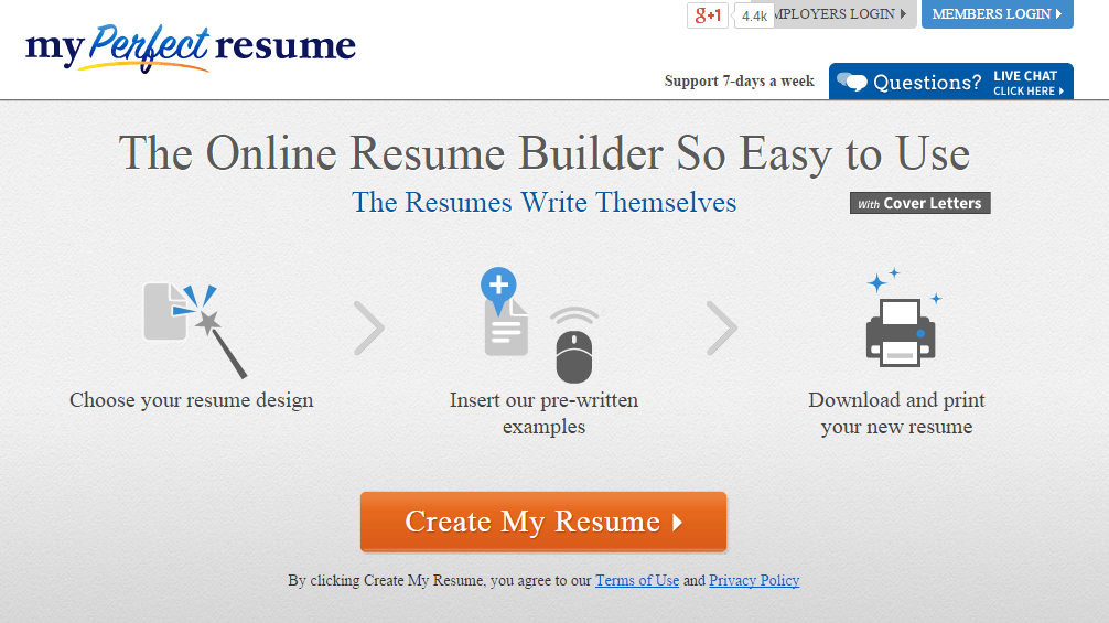
- When you write a content for services page, you encourage your visitors to book a meeting, call your business or download guide etc from such pages at the bottom of the page. Make it visible and differentiate call to action button.
Couple of examples on how this can be done.
2.Include Call to Action button
Every small business needs to have call to action strategy.
As described above, you either want your visitors to book an appointment, visit your shop, make an enquiry or request a quote.
Whatever your call to action might be, you want to make sure that it is displayed prominently in the form of button so it’s difficult to miss, in a site wide location. Use contrast colour to design your button so that it becomes visible on the screen.
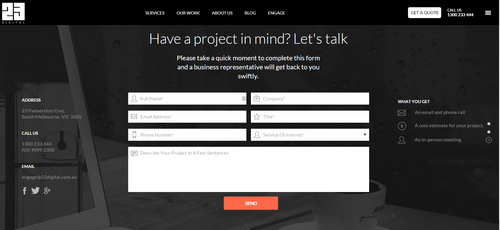
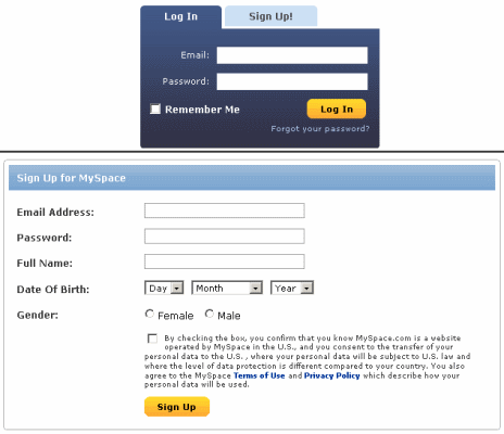
3.Include a contact form towards bottom of the page just above footer.
As you would have notice, latest trend in web design is creating a long scroll pages.
More and more websites are now trying to tell a story on the pages, and only few sites are encouraging the visitors to take an action.
I would recommend that you put an enquiry form towards the bottom of the page including a phone number to drive online inquiries.
4.Middle of the funnel content on your pages
If you’re only focusing on generating ‘hot’ new leads (those who are ready to buy right now), you’re leaving a large % of future customers likely to convert at some point. I recommend that you must take care of them NOW.
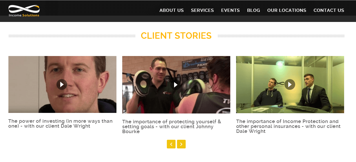
Consider proving non-sales orientated resources such as case-studies, whitepapers and guides to help demonstrate your expertise in your sector and stay in the mind of your prospects. You should do this to build a relationship so when the time comes; your prospects remember to get back in touch with you.
5.Add videos to demonstrate your product or services
If you think that your product or services are complex to understand and explain on the web page, I would recommend to create as many videos with clear heading as possible along with text.
Having a video on your website has many benefits. Google loves videos which means that a website with a video has a higher chance of appearing on page 1 than one which doesn’t.
Landing pages which have a video have a 30% lower Bounce Rate (a Bounced visit occurs when a visitor enters and leaves on the same page without having clicked anywhere else) and websites with videos have a 29% higher Time Spent on Site.
From a conversion-standpoint, websites with a video have an 85% higher conversion rate and for Ecommerce websites, we have seen this number go as high as 200% when a professionally-crafted product video is placed alongside a product page.
6.Optimise your enquiries and contact forms
I have seen many enquiries and contact forms with over 15 to 20 fields. Such forms hardly converts.
No matter how beautiful your website is, if you have long contact forms, prospects would rather not take time to fill such long forms. They have abundant choice on internet to contact other businesses with simplified processes.
The number of fields on your contact form has a direct impact on its conversion rate. The more fields, the lower the number of people who are going to fill them out.
Ask only for essential information and try to limit the number of fields to 6 or less. And, forget using the word ‘submit’. Ever. More descriptive form submission buttons can increase your level of enquiries by as much as 300%!
Instead of using words like submit, you could use, confirm your appointment, request a free quote, schedule a 30 minutes free consultation etc.
7.Use live chat if possible
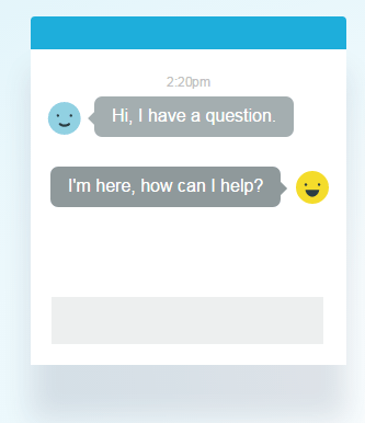
We know this isn’t feasible for a lot of businesses, but if you’re serious about finding ways to generate more enquiries, a live chat can help.
One of the perceived downsides of a live chat is that it’s found to be very time consuming without much benefits. However, the number 1 cause of this is placing a live chat widget across every page which immediately pops open once a visitor arrives at your website.
To get the real benefits from live-chat, you want to:
- Place it only on your ‘money-pages’. If you’re a hair-dresser, then this could be your Prices, Services or Request a Quote pages.
- Good live-chat software comes with a ‘nudge’ feature – you can program the live chat to open the chat invite window after a few seconds. We have found 4 seconds to be the winning number.
By inviting users to chat after a certain period of time (a) you’ve qualified them which means the chances of that live chat session amounting to something real is higher and (b) your visitors will view the invite as a useful tool rather than an annoying disruption which is the case with most websites that make use of live chat
8.Use responsive web design
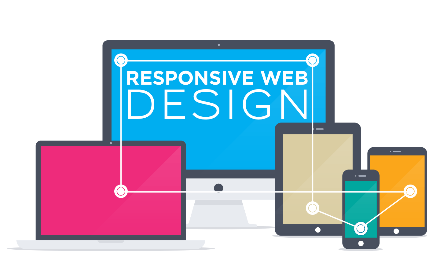
Delivering an amazing experience for your prospects has to be realized whether they visit your website via computer or smart phone. This means your site has to work perfectly on every device.
If your prospects are looking to book an appointment with dentist or they want to buy flowers for their loved ones, chances are that they likely to not have computer access and might browse for such businesses on the mobile devices.
If your site is not mobile friendly, they will end up leaving your site and hence less enquiries. You must have the site which is responsive as well as it has easy to find information to contact your business.
9.Experiment with your page headlines
Headlines are very important. Would you read an article on newspaper with poor headlines?
It must draw your prospects attention and it must highlight the problems that your prospect would like to solve.
You can’t master it on go and it must be experimented to come up with great headlines.
Getting your prospects to read about your products and services will also help you increase the chances of them getting in touch with your business.
Conclusion
To conclude this, you must work towards implementing all the necessary elements on your website to increase the leads. I hope this has been helpful, please do leave your questions or comments below.
Good luck with your improvements and do get in touch with us, if you would like to increase the leads from your website. At ZOFELA, we have worked with many businesses to increase their conversions and help them generate enquiries over 200% more than what they used to received.
If you found this post useful or interesting, I’d appreciate you sharing the post on your social media below.
