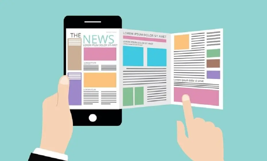
These days, if your website is more than a couple of years old, it’s already obsolete.
The current driving force of this rapid change? The rise of smart devices.
If your website does not cater to this rapidly expanding segment of the market, chances are you will be left behind.
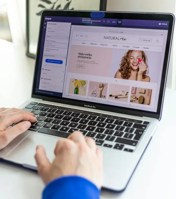
If you have a website, there are ways to improve your inflow of online enquiries. Utilising the simple elements listed below will help drive more leads for your business.
1. Unique typography
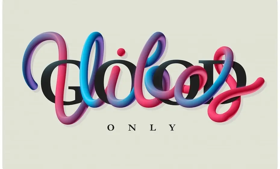
Careful font selection and proper use of headings, hyperlinks, quotes and line spacing are all important elements of unique typography (this term refers to formatting of written information across a website’s design).
Typography uses one design trend across a website that leads visitors to its different sections.
When creating your company’s brand style guide, it is important to consider typography; if it’s designed well, it can play a large part in influencing your website visitors to read your content and take an action.
2. Content personalisation
Content personalisation starts as soon as a user registers on your website.
From here, your website should start recording all a registered users’ net-surfing activities and use this information to make recommendations for related products and services that are offered by your business.
Many sites just have ”welcome” when a user logs in. However, a more personalised message like “Welcome Michael, start shopping with us” is more likely to influence a user to stick with the brand.
3. Use of high-quality and relevant images and videos
The human brain processes visuals 60,000 times faster than text.
Visual content also drives user engagement.
Instead of just listing text about your business processes, adding HTML 5 interaction to your website makes content more engaging to the user. As an example, a mere month after Facebook introduced the timeline feature for brands, companies saw a 65 percent increase in engagement with their visual content.
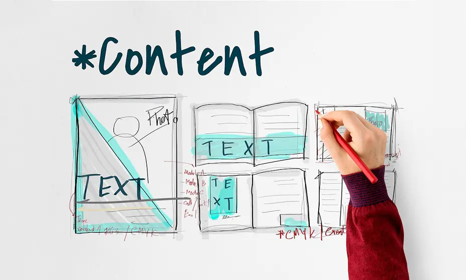
This means it’s important to put effort into your website images. Take time to research and select high-quality photographs, other images (i.e, infographics) and videos that relate to your website content and are consistent with your brand. If you sell products through your website, each product should be accompanied with at least one attractive photo.
4. Use of flat design
Flat design is known for its simplistic appearance. Instead of using 3D effects and other design techniques, flat designs use simple graphics that typically have bright colours.
One the main reasons to use flat design is to provide more focus on content. It allows website visitors to get right to the point by putting emphasis on the content over other design features. Also, the use of bright colours makes websites looks much cleaner.
By focusing on content and simplistic visuals, you may find you get more conversions than you would with a fancier-looking website.
5. Scrolling within page (Scroll to page section)
Gone are the days when users waited for another page to load so they could get more information about the page they wanted to read.
The scroll-to-page section technique allows you have everything organised more efficiently on one page instead of clicking from one page to another to get all the information. This avoids multiple clicks for the user and ensures that content is usually content ordered in a way that makes more sense to the reader.
6. Large Banners with proper image
You might have noticed many websites with very large banner images to highlight the message they want to give to their audience. This is another design tactic that we are seeing more and more, and it’s effective because large banner images help designers highlight a key message about product or service in more efficient way.
As well, this design technique enables you to reinforce the benefits of a product or service on a page by outlining them in a visual that can’t be ignored! It also captures visitors that otherwise will skim over text and then leave the site. Placing a call to action button on this large banner also helps you increase enquiries and conversions.
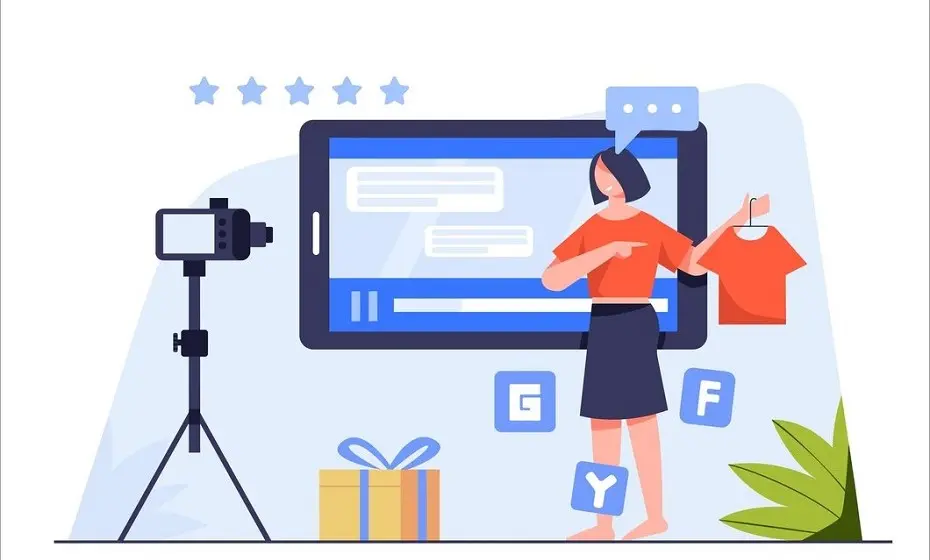
7. In-depth product or service videos
In addition to large banner images, companies are also beginning to use in-depth product or service videos and video testimonials from clients. According to Nielson, 92% of B2B customers watch online video and 43% of B2B customers watch online video when researching a product or service.
Videos allow companies to explain aspects of the product or service they think their prospects will value the most. Through these videos, you can walk them through your process and easily explain how to use your products; they offer benefits to customer service as well as usability.
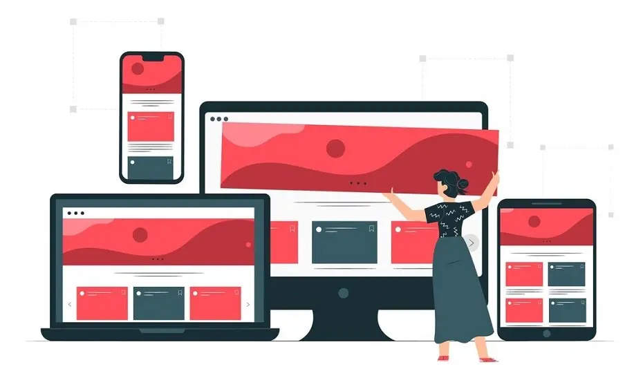
8. Responsive Web Design
This is a must-have feature if you are planning to redo your website, or are investing heavily on search and paid marketing.
Your online customers are coming from all over the place, and you can’t be sure if they’re finding your website from a phone, tablet, or desktop computer.
Ensuring your website is responsive makes for a good user experience. Today, up to half of your website hits come from mobile devices, and slow response times on these can cost you revenue.
To prevent this, tie the fonts used in your web site to your brand and have a professional website designer use Cascading Style Sheets (CSS) to ensure your background images load correctly and quickly.
How ZOFELA can help you?
If all of above sounds interesting to you but you need help improving your website, we can help.
We’ve helped over 400 clients increase their customer base by 25% or more. Schedule a free consultation today to learn how we can design your website that could help you generate more sales enquiries for your business.
