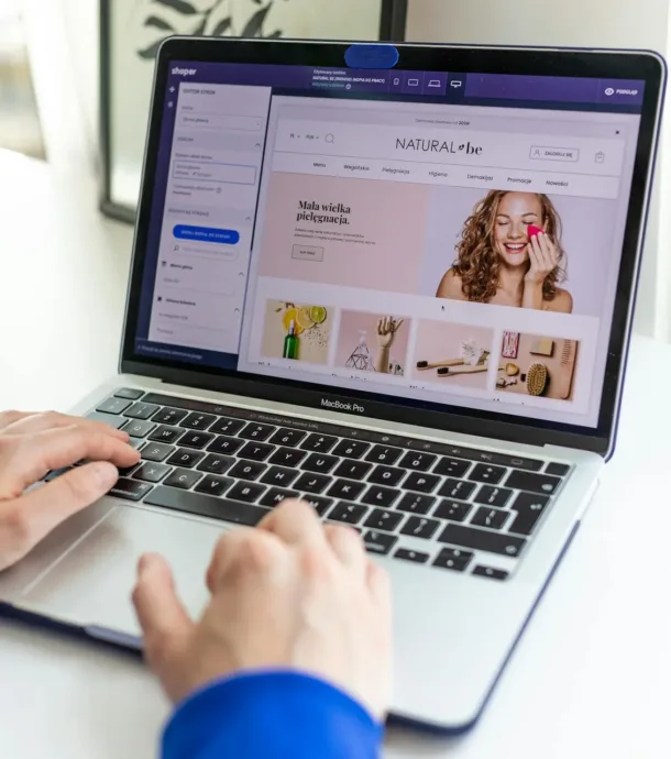
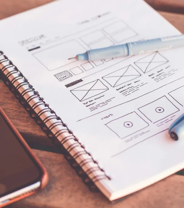
NOTE: This is the second segment of a 7-part series that describes the eCommerce web design tips. See the index to this series for the complete list.
If you are an entrepreneur looking to set up an online ecommerce business or already having an ecommerce website, but want to improve user experience and increase conversion,you must make sure that your site is designed to deliver results.
We have put together this series of articles to help your create a great ecommerce web design and our list is complete with examples.
In a first of its series of blog posts, we will talk about home pages and category pages.
The home page along with category pages are core pages of your ecommerce website and can make or break your product offerings.
Customers run into problems when they can’t tell you what your site sells or can’t find the product they want to buy.
This blog will help you present the right amount of information and organise it well.
1. Best Practice for ecommerce home page design
The home page of an ecommerce website is a lot like prime time television slot. It is the store front and the entry point of your site. If you have a retail shop, how much careful planning you would do to attract customers into your shop? The same should apply on your ecommerce home page design. It must at least cover following:
- Create a good first impression
- Keep customers on your site
- Sell and build trust
- Introducing your website as a great place to shop
- Shows what you sell and how you are different
To achieve above objectives, you must start with planning your website layout in a way which can address all of above objectives. We have put together our findings below.
Ecommerce Header Design
Your site’s header is one of the most important components for the simple reasons that it’s the first thing your visitors will see and it appears on every page.
Although the look of these headers will vary greatly from site to site, they should all contain the following elements.
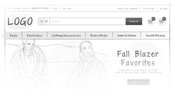
- Logo
- Site Search
- Phone Numbers
- Secondary Navigations
- User Login and Register Link
- Link to Customer Service Section
- Shopping Cart
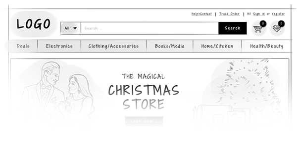
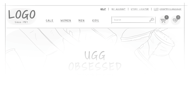
Below image shows a starting guide for header design.
We have worked on and analysed number of great ecommerce header design examples and picked few great examples for your reference.
The Iconic has a very simple but most user friendly header design of all.
Design an easy to use navigation bar
How many websites have you ever visited, trying to search for information but eventually giving up because you couldn’t find what you were looking for?
The structural placement of your pages is critical to reducing bounce rates.
If visitors can’t find what they are looking for, they will quickly lose patience and click off your site to try to find the information elsewhere.
Make sure your visitors easily find their way around your website.
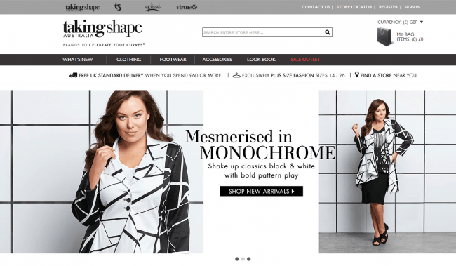
Place the navigation bar at the standard positions where visitors expect to find them -“preferably horizontally on top or vertically on left.
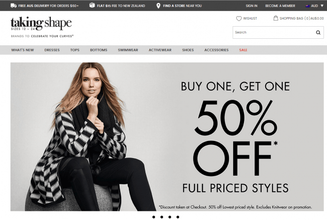
You could also make your navigation bar persistent like Taking shape did here.
Home Page Banner design
I have reviewed number of ecommerce websites over the years.
What I have learnt is that great banners on the site is the main difference between good and elaborate design, and the visual factors of an ecommerce sites that influence shoppers to buy products.
Many ecommerce web designers believe banners add visual appeal to the top of a site, and allow a merchant to feature sale items, new inventory, and so forth.
So, if you haven’t yet been steered away from utilizing banners in your own commerce design, follow these steps to implement.
- Make rotations manual, slow to rotate if automatic. No one should have to take a speed reading class to view your banner’s message.
- Keep the number of images to a minimum. Less is better.
- Messages should be short and to the point. Even if users can manually rotate the banner, do not overload with text. Let the users click to a page to read more.
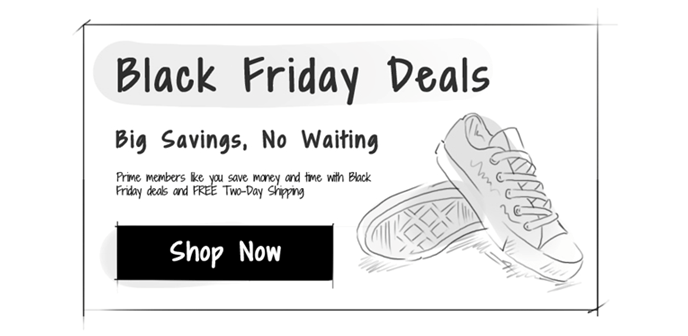
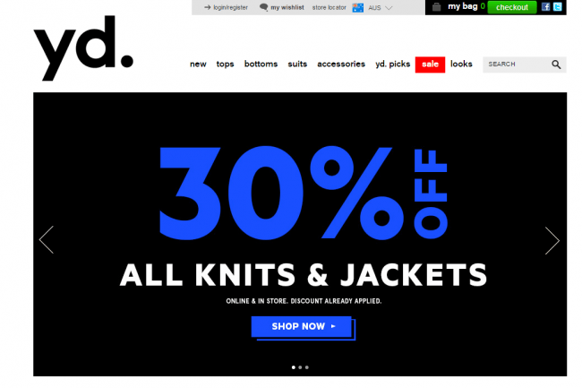
- Include calls-to-action on your banners. This could include “Click Here,” Learn More,” “Shop Now,” “Click for Deal,” and so on.
- Keep your banners near the top of the site. This is often difficult, as screen resolutions greatly vary across desktops and tablets
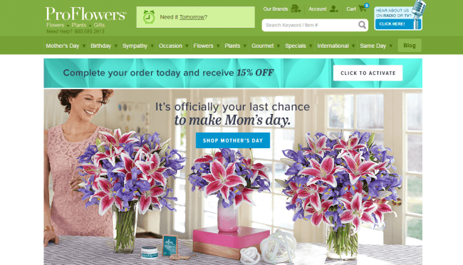
- Holiday-themed banners tend to have higher conversion rates.
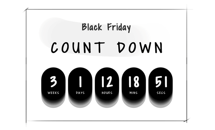
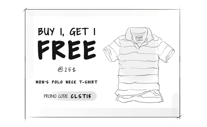
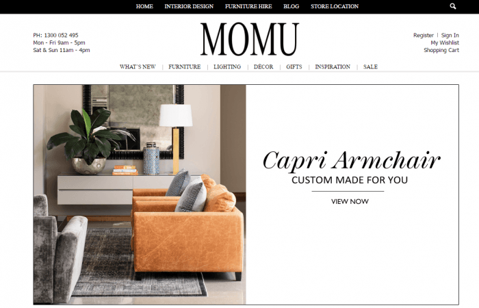
Some of the examples of the great eCommerce banners.
Convey Value Proposition
What a visitor sees in the first few seconds on your homepage is very crucial.
It’s important that you establish your logo and communicate your value proposition instantly and don’t come across as any other mom & pop store.
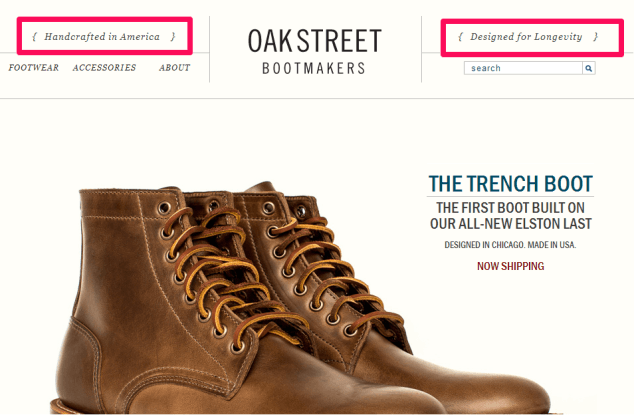
In the example above, Oakstreet establishes its competitive edge by saying “Designed for Longevity” and “Handcrafted in America” – both statements signifying premium quality. Check out this article to find out how a good value proposition can boost conversions.
Different ways to capture your value proposition.
- Be Specific for Better Clarity and Impact. A USP that says, “Get better at dating” is not okay. “Quick background check software for your first date” is intriguing.
- Your Prospects Should Understand within 5 Seconds What Your USP is. If they have to read more text to understand the value of your offer or company, you are doing it wrong.
- Communicate Concrete Results. Talk about percentages and something that provides direct value to your customers.
- Say How You Are Better Than Your Competitors. What gives you an edge over others? An important distinctive feature or a unique value-added service, whatever it is, let it make way for your conversions.
- Avoid Superlatives and Unnecessary Hype. With everyone saying things like, “we are the best printer ink provider in the Australia” and “We are the #1 Jeweler in China,” customers have become good at tuning out such self-exaggerated claims. It is okay to go with such superlatives if you provide solid proof and data to back up your claims.
Create an easily identifiable Sale section
According to an E-tailing Group study, 47% of online shoppers want to buy only discounted products, except under exceptional circumstances.
It also found that 62% of buyers are looking for a separate section of products on sale.
So do yourself a favour. Create a discount message on your home page, line them up in a separate section and then dedicate it to the discount seekers.
Create a Great Footer Design
Picking the right footer for a design can be harder than it seems.
But a good footer can have a great impact-both on the impression you make, and the actual behaviour of your visitors.
It can be a challenge to provide a sensible way to navigate a big site with a lot of sections.
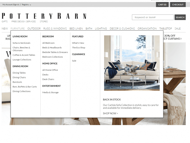
Even with drop down menu’s, there is a limit to the number of elements you can stuff into your main navigation.
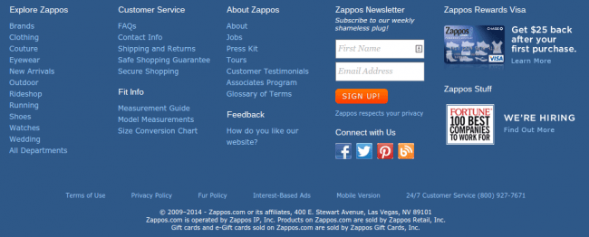
That’s why the Fat Footer-which contains the whole sitemap-has become a common design pattern.
This can be a good choice for big corporate sites, or online shops.
Your footer should feature a sitemap of the main sections of your ecommerce site.
This is provided so that a visitor doesn’t’ need to scroll all the way back to the top to navigate to another area of the site.
2. Category Page Design
For an e-Commerce store, every user who visits the website is a potential customer.
A successful e-Commerce store is one that converts a high number of visitors into buyers.
Everyone wants a high conversion rate. But getting there involves more than just optimising a single page.
To get a high conversion rate, you have to optimise the buying process, and that starts with your category pages.
Importance of a category page
The conversion funnel starts with the category page.
This is the page that most users will see.
The goal of the category page is to get as many users who see this page to go to a product page that matches what they’re looking for.
To do this, you need to optimize the category page so that users can view and browse products in an easy and intuitive way.
Your category page should not make users to have to go into a product page to check if it’s the particular product they want.
Instead, the view and layout of the products on your category page should be clear enough so that users can spot what products they want without doing the extra work.
E-Commerce Web Design: What makes the perfect category page?
The main objective of category page is to capture user’s attention and help them make the purchase decision by allowing them to find the product they are looking for. I classify the usability of an e-Commerce website into three sections:
- Attention: A website visitor can arrive on this page from your website’s home page or from search engine. At this point, you should make sure that your page is designed to retain the user on this page.
- Capture: Once you have got the visitors attention, you must guide them to the next step: encouraging the user to visit specific product that they would like to buy.
- Decision:Once the user has visited the product detail page from the category page, you must encourage them to buy product and create a funnel in a way that leads to sale.
Attention:
When user visits the category page, they might have come from two sources:
- Either from website home page or internal link pages
- From Search Engines.
Understanding above context assists in developing a clearer view of the purpose of the main category page. I have highlighted few pointers below.
- If the user comes from search engines, they have been taken directly to the right page, as this category page was listed on the search engine and user is interested to find products that are related to the category.
- Once user land on this page, you are presenting the options of subcategories to the user. And hence, user is further able to move to the subcategory which interest them. If you are running a category specific sale, please mention the offer on the page or any customer service relation message as well.
- Maintain buying momentum by making the next step of consumer’s journey seamless and easy.
- Introduce feature products.
Capture.
I have set out a guideline on how users navigate, find and select products on e-commerce websites, using the category navigation.
-
Don’t make main category page shallow. Make sure that you create a landing page for all category hierarchy.
I have observed many ecommerce site, where they do not have main category pages created. One of the argument is to reduce the click. However, there is a work around this. You can make the category clickable and at the same time, allow user to browse subcategory on mouse over. Most visitors expect these category headings to be clickable and often tried clicking them, despite cursor indicating unclickability.
-
Create a customer service bar below the main navigation
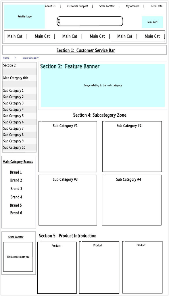
This is not a banner and just an area to display the customer service message like, free delivery on all orders or free returns etc. This allows users to shop with confidence. Remember this is not a banner. Please see below wireframe.
-
Feature Banner (Below customer service bar)
This is very important area in the category listing page, to capture user’s attention. Design a banner that captivate users and motivates to stay on the page.
-
Left-hand Column to offer filtering
This is a must have feature for the website, even though it is a repeat of what is there on the page, you could include some filters like Brands, Style, colors, price range and filter subcategories even further based on the selection. I have observed very few sites that does this.
-
Introduce subcategories below Featured banner
This is a great place to showcase your subcategories with great images. For example, if you sell furniture, on the furniture main category, you would show, sofas, chairs, dining table etc with attractive image of the bestselling products to capture user’s attention.
-
Introduction of the feature products.
If you have done the research and know, what the bestselling products is, you must make sure to display those products below the list of subcategories to again capture the visitor’s attention to those products. This helps you reduce the bounce rate from the page.
Decision Making:
In the usual process by which customers become increasingly interested in your website products, it can be expected that, once those products have been located in the category page, users will want to find out more about them and click to obtain more information in the product page.
Above will the base most of the time but not always. If the user to your website is a repeat visitor who has already looked at the product but did not buy and returned few days later, they would like to buy it from the category page itself. In this case, you can skip a step and make the sale directly. To do so, you must find a balance between the information to be displayed in each product box in the category list:
Firstly, you will want to display all the product information possible, and secondly you will want to save space so as to display as many products as possible on the screen. The items to be shown will depend to a large extent on the type of store, but, as a general rule, you can display:
- Basic information: main photograph, name, and price. The photograph should be large enough to see the product details, but small enough so as not to take up too much space. The name and price should be easy to identify taking a quick glance down the list. In the case of a discounted product, you can display a small stamp and the previous price crossed out. You can also use stamps to indicate key product factors, such as the fact that it is new in the store. If you display products that cannot be bought because, for example, there is no stock, this information should also be given.
- Additional information: depending on the type of your business, you might want to show the product brand or some of its main features. For example, you can show the size of a television screen.
- Purchase button: as we have seen, the purchase can end on the category page. A button to buy or add to the shopping cart is perfect for this.
In case the product requires the attribute selection, you can do this by the way of pop up or coding it in a way that for such products, users will be redirected to the cart page to make the selection. However, you should be careful with this technique, because, although it can be very useful, it might hinder the user from leaving the cart if not done properly.
In next Blog post, we will cover product pages.
