NOTE: This is the fifth segment of a 7-part series that describes the eCommerce web design tips. See the index to this series for the complete list.
For many eCommerce site owners, shopping cart abandonment and conversion rates drops on the checkout page.
So, what does a great checkout process make? Minimal steps? Short forms to fill up? Zero distractions?
If you are reading this article, it is safe to assume that either you have an e-Commerce site or are building one, and you’re wondering “What can I do to increase my conversion rates?”
Well, then this post is for you!
I have complied this list of must have in your checkout page.
Use each elements wisely and drop them from your design if you think it might not be relevant to your business.
Checkout Page Design Guide
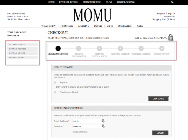
Create a Visual Checkout Process
A typical checkout process has six stages, which may be reduced or expanded based on the need of a particular type of an eCommerce website.
As you can see on the image below, checkout has clear progress on top highlighted section below. Also there is a phone number and link to a customer care email address listed on top section in case if user finds any difficulties checking out.
Keep the checkout forms shorter.
Ideally, you would want to make sure that your forms are kept shorter to assist your customers checkout faster.
Our recommendation is to not ask for billing address unless your payment gateway requires this. This results in a faster checkout process due to the fact that customers don’t have to fill in their information twice.
Create Automatic Guest Checkout.
When your customers land on the checkout page, allow your customers to checkout as a guest if they don’t want to register on the website.
This ensures seamless and faster checkout process for new and recurring customers. When customers are forced to create an account, it slows down the checkout process while making your customer do an extra step.
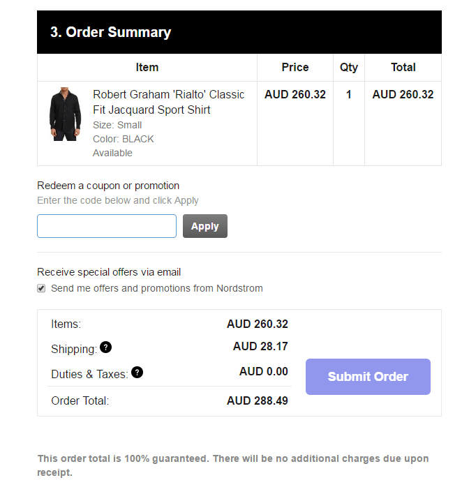
Show order summary with product images.
If you design checkout pages so that when they are completing the checkout page, they can see their product images in their order summary section. It should display product attribute, optimised product image, price, qty and Order total with an option to redeem a coupon or promotion.
Remind them about the GOOD stuff.
It is always good idea to show the point of difference to your customers to keep them coming back. It is always better to show on checkout page when their goods will arrive? How much is the shipping? will their transaction be secure? Showcase any offers that you want to promote. Remind them again.
Conclusion:
Start your eCommerce optimisation efforts at the checkout flow. Relative gains here will result in very nice absolute sums.


