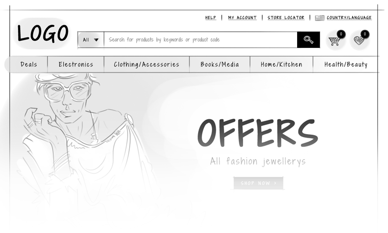
All website owners would agree that allowing your customers to be able to find the products they are looking for is one of the most important factor in ecommerce website design. This can only be enabled by simple search mechanism. Many website owners and e-Commerce web developers would think that by putting an advanced search options, they need not work on the simple search function and many times, it is left unattended and almost no attention is given to the site search functionality.
In this blog post, we will review how to build a search interface that offers user the power of advance search through simple search elements and faceted search on the category listing page.
Search Interface
1.Make you search box easy to use
One of the first hurdle is to make the search box visible an easy to find for your website visitors. The next hurdle is to make your search box easy to use.
My recommendation: Put some meaningful text inside the search box and make it disappear as soon as user puts cursor inside the box. Once user enter search term and if the results returns zero results, don’t leave it there. Instead put some meaningful text apologizing and provide them some suggestions based on the search terms entered.
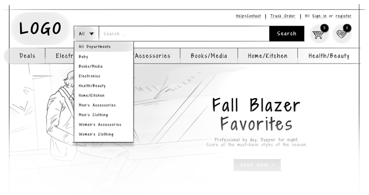
2.Allow customers to search from within the categories on your website.
Although this is not applicable to all e-Commerce site, it is critical for a large e-commerce website design with wide variety of products. Allow website visitors to search from within the particular category. Please make sure though that you default your search scope to entire website and not preselected category which is displayed on top.
3.Suggestive Search:
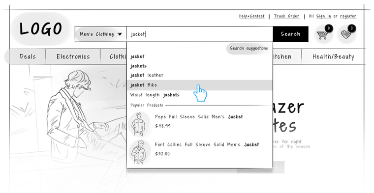
This is the most popular method to allow users to find what they are looking for. As soon as a website visitor starts to type in the search box, offer them smart suggestions automatically in a dropdown underneath the search box.
If you suggest few best fit products along with thumbnail images and prices of the product suggested, user might find what they are looking for and could land directly on the product detail page and increase the chance for your conversion.
Faceted Search
Many ecommerce web designers call faceted search or faceted navigation. Irrespective of what they call it, it enables website visitors to browse large sets of products quickly and intuitively. We will explore those options below.
Firstly, LET’S understand what are the facets?
Facets are categories into which the properties of the objects could be subdivided further. These categories contains sub objects by which the list of products can be filtered. Â A classic example is laptop. A laptop could come under different brands, screen size, memory capacity, hard drive, operating systems and weight.
Imagine a website where they sell over 200 laptops and you land on the product page without faceted navigation. How difficult it would be for you to find the product you are looking for. What would you do in such a case? Continue to browse each products or abandon the site and go look the products on some other site.
1.What is the best way to present faceted navigation
Frequently, filters are placed on the left-hand side of the screen, as with Amazon; or horizontally across the top of the search results, as with Yelp. Studies show that the latter arrangement is more common. This makes sense, since it makes the filters more visible.
However, a horizontal arrangement also pushes the content further down on the page. For this reason, many e-Commerce web designers opt to place filters in a vertical list on the left of a page. (It’s also possible to place the filters on the right, but usage plummets: they might as well not be there at all.)
2.What are the best way to display and interact with faceted Search
Once the position of the facets on the page has been decided, you must determine how to display the set of values available for each facet. Again, there is a great deal of variation between sites. The simplest solution is to represent the options as simple links. Other options include sliders, dropdowns, checkboxes, and input fields.
Which display style you use depends on many factors?The values of facets such as Colour and Region will probably be text-based with checkboxes or just a text links. In contrast, numeric values can be shown with sliders or input fields.
Different examples of the faceted Navigation
http://www.smileycat.com/design_elements/faceted_navigation/
How to address Search Engine Indexing problems in Faceted Navigation?
If you are planning a new e-commerce website design or considering a redesign for your existing ecommerce website, I would recommend that you seriously consider the search engine indexing problem and reduce duplicate content. Based on the guideline provided by Google on their webmasters blog, you should visit their best practices for new faceted navigation implementations or redesigns article.


