Ever wondered why your email campaign is not generating the leads?
Did you ever thought of increasing your leads from your paid adwords campaign?
Have you ever been told about landing page strategy, but not sure how to start?
If any of above questions or thoughts have come to your mind, read this blog post.
I have written this Beginner’s Guide to designing effective Landing Pages that converts for all those business owners and marketers who are just starting out or would like to improve their existing landing page strategies.
Lets first define what landing page is?
In the purest sense, a landing page is any web page that a visitor can arrive at or “land” on. However, when discussing landing pages in marketing and web world, it’s more common to refer to a landing page as being a standalone web page distinct from your main website that has been designed for a single focused objective.
This means that your landing page should have no global navigation to tie it to your primary website. The main reason for this is to limit the options available to your visitors, helping to guide them toward your intended conversion goal.
There are 2 types of landing pages.
- Click Through Landing pages
- Lead Generation Landing pages
What is the Goal of Click Through Landing pages?
As the name implies, click through landing pages have the goal of persuading visitors to click through to another page on your website.
If you sell complex product or a product which requires to be explained throughly before the visitor make up their mind to purchase that products, often click through landing page concept is used.
The core fundamental of using this types of landing pages is to drive all inbound traffic to the page where sufficient information about the product is presented and buying urgency is created. This page itself will act as shopping cart pages and lead user to the checkout process.
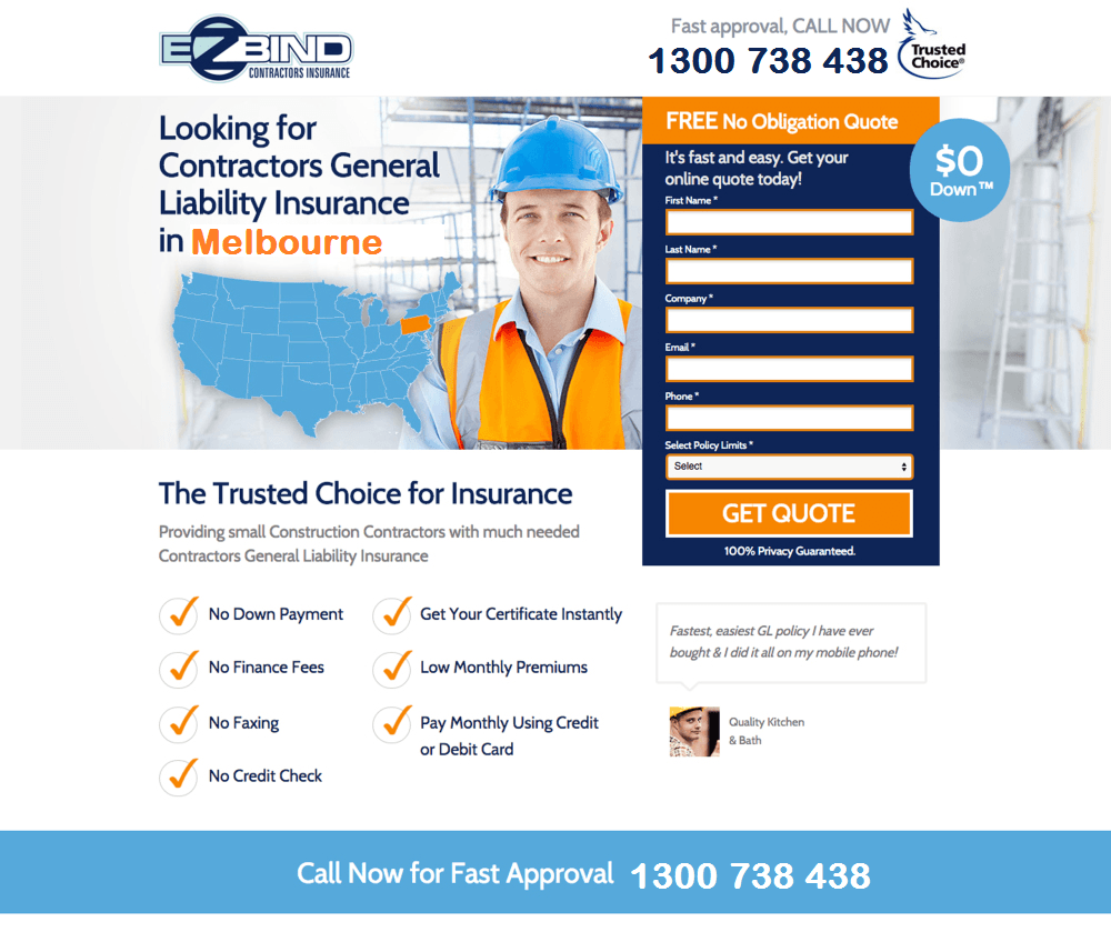
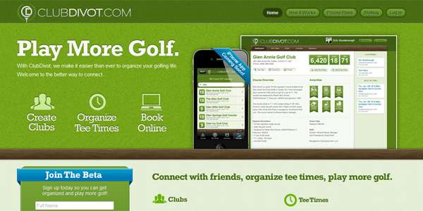
Below is an example of the click through landing page.
What is the Goal of Lead Generation Landing pages?
Lead generation landing pages are used to capture the visitors information such as names and email addresses.
Sometimes, these types of pages are used to collect these data in the exchange of providing free information such as eBooks, white papers, case studies etc.
The main purpose of these pages is to collect data that will allow you to market to and connect with those prospects to create awareness about your products and services.
There are many uses of lead generation landing pages as listed below.
- Ebook or whitepaper
- Webinar registration
- Consultation for professional services
- Discount coupon/voucher
- Contest entry
- Free trial
- Notification of a future product launch
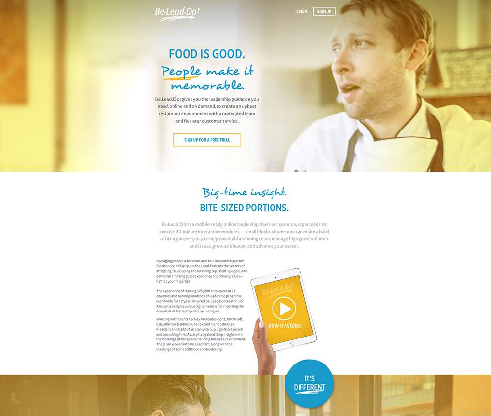
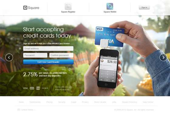
Below is an example of the click through landing page.
As you would agree with me that the most biggest challenge of any business is to convince its prospect to buy its product or services. Even harder challenge is to convince the prospects who are unaware of product or service and is not in the need of using such products right now.
That’s when an effective landing page can come to your rescue.
If these pages are done well, it can even makes you money while you sleep.
But making an effective landing page is not an easy job.
To help you understand what makes an effective landing page, there are certain elements that make the difference between an effective landing pages and horrible ones.
Lets now explore some must have common elements between these two types of landing pages.
1. A Clear Headline and call to action:
The entire point of a landing page is to get users to take a specific action. Therefore, your headline and call to actions are the most important elements on the page. Generally, the call to action on a given page is a button, though sometimes it’s a link or form.
Once you know what your goal for the page is, you need to come up with clear headline which conveys the message and grabs the visitor’s attention.
It should entice visitors to read further about your product or services and encourage them to take action.
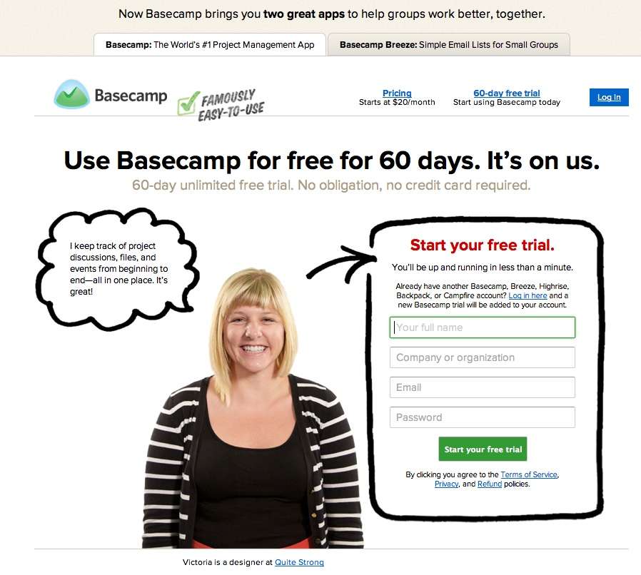
Below is an example of landing page, and its purpose is to encourage users to try basecamp for 60 days. Headline is catchy and prominent on the page along with prominent call to action.
On the example above, as you can see, a clear call to action is implemented smartly. Start your free trial and the form is highlighted with visibly happy project manager explaining the advantage of the basecamp.
2. Simple but clear and concise copy on the landing page.
You need to make sure that you keep all the clutter away from the landing page. The design of your landing page needs to be quite simple and stick to its specific goal.
Many landing pages are full of information and looks like a web page on any blog site.
No wonder why these pages do not work.
Your copy must be clear and emphasise on the headline that you have written. You can pretty much assume that most people who land on your page knows or requires the kind of product or services you are selling as they have come from the PPC campaign or an email campaign that you might have run.
You need to make sure that every single word or sentence in your landing page should serve the purpose or else it does not need to be there.
3. Image Should reinforce the message
The images you use on your landing page should reinforce your overall message. The image should convey the same impression that your copy conveys.
One thing to keep in mind is that anything with a human face is more likely to draw the eye than any other element on a page. Therefore, if you are planning to use human face, sometimes, it can take away the main attention from your headline and conversion can get lost.
You need to use your images smartly. If your landing page is about an app or other online service, then placing a screenshot of the product can make the huge difference.
All you need to keep in mind that the purpose of using the image should be not to fill the space but reinforce your message.
4. Keep your lead capture form simple.
If your landing page include a form, you only need to ask for vital information. If your trying to get visitors to sign up for a trial, their first name, company name and email address is sufficient.
If you need to sign them up for newsletter, first name and email address will do your job.
If you are asking them to do something else, please make sure that you make it as easy as possible.
5. Build Trust and Credibility by placing testimonial.
In the spammy internet space, whom do you trust.
People would like to do business with people. So you need to build that trust.
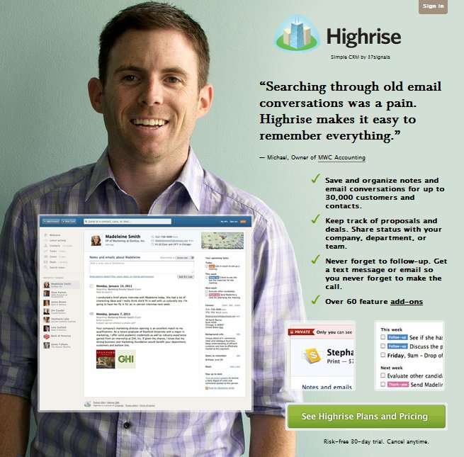
One of the best way to build trust and credibility is to use testimonials of the known names or brands who are using your product or services.
Below is a very good example from highrise from 37Signals.
6. Do not place Navigation unless required.
This is the main differentiator between landing page and your website.
If you need to place a navigation on the landing page, you would rather do that as a web page and not call it as a landing page. When visitors land on your page, your sole objective is to encourage your visitors to take the action you would want them to take.
7. Match the look and feel of an Email that you sent.
If your landing page does not look like an email that you just sent, you will need to do all the convincing again and chances are that it will not convert as good. If the designs of the two are wildly different, your landing page visitors may wonder if they’ve ended up in the right place. The easiest way to do this is to carry over fonts, images, and colors from your email to your landing page.
8. Your landing page needs to look great.
How do you judge the credibility of the website?
What criteria do you use?
I bet the first one would be the way the site looks. Most people assess the business based on the way their site looks. If the site is more professional looking, people would term it as a credible business.
Therefore, make your landing page look great.
How ZOFELA Can help you with your landing page strategy?
Landing page are the way forward in this highly competitive web sphere. To put your business ahead, contact ZOFELA about our designing effective landing pages for your business. We can develop a landing page strategy to interest your current patrons and appeal to potential customers.
